FONT FRIDAY - MANHATTAN
Did you know that New York City is separated into five boroughs? Technically Brooklyn, Queens, the Bronx, Staten Island and Manhattan are all part of New York City. However, most people (especially us Long Islanders) consider Manhattan "the City" and we never call it "New York City". It's either Manhattan or the City, and that's how we roll.
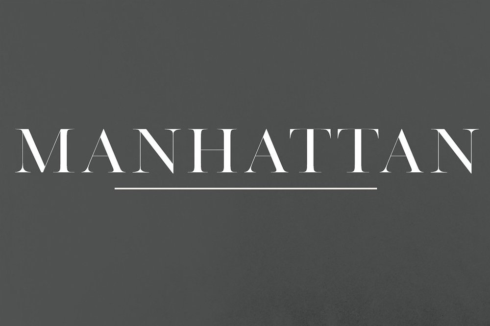
As a location, New York City is iconic, bold, and fresh - much like the font Manhattan. I'm always on the lookout for strong, versatile serif fonts, because there seem to be far too few in this calligraphy-inspired world we're living in right now. True, I love calligraphy fonts, but I love balance, too. Manhattan is the perfect balance, in my eyes. I adore the juxtaposition between the super thin lines, the thicker lines, and the strong serif style. I can see Manhattan being used on an invitation as a couple's name (since it's only available in headline, all caps at the moment), and then paired with a really clean sans-serif, and whimsical script as accents. The perfect trio of fonts, if I do say so myself.


Head on over to Creative Market to grab Manhattan for just $15! And then show me how you're using it - I LOVE seeing my Font Friday selections being used in the wild (erm, I mean real world).
Love fonts as much as I do? Follow along every Friday for Sincerely, Jackie's Font Friday features, and catch up on past Font Friday selections. Want even more font goodness? Follow the Sincerely, Jackie FontabulousPinterest board. Some posts may have affiliate links, but all opinions are 100% mine. I'm an incurable font-aholic, what can I say?
Sincerely,